• Dear forum visitor,

    It looks as though you have not registered for a forum account, or are not signed in. In order to participate in current discussions or create new threads, you will need to register for a forum account by clicking on the link below.

    Click here to register for a forum account!

    If you already have a forum account, you can simply click on the 'Log in' button at the top right of your forum screen.

    Your Elvenar Team

Mobile 'Hide UI' tab

Mobile 'Hide UI' tab


  • Total voters
    15
  • Poll closed .

LordVorKon

Active Member
Summary: On the mobile app, add a tab that will hide/show parts of the UI when tapped.
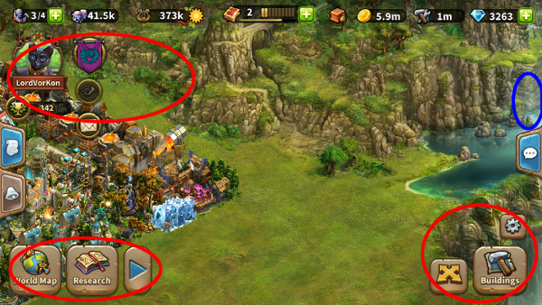

Elvenar.png


I have marked in blue where I think a good place for the tab would be, and in red the bits of the interface I'd like the tab to hide when tapped. This specifically should include the event access banner, when it is present. All of these things take up a significant percentage of screen space even though they might not be commonly used.

This tab should be of the same size and style as the chat, notifications, and quests tabs, all of which should specifically NOT be hidden by this feature.

Benefits: Sometimes the various interface buttons get in the way of collecting from buildings and/or event currency drops on the edges of the map.

Drawbacks: Increased app size? Some users may be frustrated by having an additional control to accidentally hit. New user guide/Tutorial may need to be updated to cover the added functionality.
 
Last edited:
Yogi Dave

Well-Known Member
This is a great idea and over the open chat tab seems like a great place for it.
I can't see why this would really increase the app size by much at all, so don't consider that a drawback.
The only question I have is what icon would be in the tab? Perhaps just the letters UI would be sufficient. Suggesting one certainly isn't required. I've mentioned it to see if there are thoughts on it or just leave that to the devs without input from us.
 

Deleted User - 1178646

Guest
It could be anything,

It will require a rework of the tutorail to include this "tab" so people know of it's existence en support would not be overwhelmed with people that "lost" there ability to build / play.
 

Yogi Dave

Well-Known Member
It will require a rework of the tutorail to include this "tab" so people know of it's existence en support would not be overwhelmed with people that "lost" there ability to build / play.
This sounds like something that should be added in the proposal as a con or consideration. I had wondered about the problem of people accidentally pushing it, then being confused as to what had happened.

Of course, reporting it to support might be difficult since the gear icon is gone per the proposal. The gear icon should also be left, but moved to the bottom right corner so it doesn't hang out in space. That would also allow it to possible remember the UI setting when you log out and back in.
 

AtaguS

Well-Known Member
I like this suggestion, and I wonder if just a triangular arrow pointing toward the game is enough of an icon to get people to use it....it would just serve as a hint that there is a drop down of stuff behind it. That may offset the "con" of folks not knowing what's back there.

The few times that I've had to use mobile, I have found some of these utilitites in the way as well...particularly the Move Building one...which on mobile easily turns into Sell Building if you aren't careful and I've come close to doing just that a few times. So...this idea would get a strong yes vote from me.
 

ajqtrz

Chef - loquacious Old Dog
Static items on the page that float over the actual game are always questionable. The devs could have, of course, done away with all the tabs and put what those tabs display when activated on the screen permanently with all the things already there ... but they figured out pretty early that you'd not be able to read the screen below so many icons. All of which means the devs do understand that control icons can hide a significant portion of the screen. Thus, they should be able to both do this and want to do this since a "clean" or "uncluttered" screen, especially on a small mobile device screen, is I presume, vastly preferred by the users. As for "training" the users I suspect our "tap happy" players will be confused for about 1 second before they click on tap on the new icon to see what it does. When that happens and they see all the "missing" icons, they will smile, nod their heads and say to themselves, "yeah, that's the way it should be!" And I'll be smiling with them.

Of course, why not have everything put away? Why not just have one or two icons in the lower right -- the "in/out of full screen mode" and the "cog/help?" Even the menu at the top isn't needed most of the time. It's sort of like Microsoft Word or Excel in "full screen mode" All you get on screen is your work and everything else is hidden. Same with your browser in " full screen mode." Full screen mode for mobile would really use the space nicely and with a single tap you could return to the present configuration. In essence this is what this request is about, I think.

AJ
 
Last edited:

LordVorKon

Active Member
I suppose my thoughts could be summarized as this: Hide the navigation elements; leave the information elements.
 

Iamaita

Well-Known Member
I’m a newbie, and I play almost exclusively on mobile. I love this idea. It would have been especially helpful on the FA... I had to keep zooming in and out to access parts of the map that were hidden behind everything.
 

LordVorKon

Active Member
About a week left to vote on this if you're so inclined.
Surely a higher vote total is more convincing than a lower one, no matter how unanimous, yes?
 
Top