 Dear forum visitor,
It looks as though you have not registered for a forum account, or are not signed in. In order to participate in current discussions or create new threads, you will need to register for a forum account by clicking on the link below.
Dear forum visitor,
It looks as though you have not registered for a forum account, or are not signed in. In order to participate in current discussions or create new threads, you will need to register for a forum account by clicking on the link below.
Gkyr
Chef
Current situation: when one opens an encounter in the map view, the spire, or the tourney, one gets an encounter window that is essentially the same for all encounters. It has the convincing/negotiating/catering choices grouped on the left and the shady characters battle queue on the right.
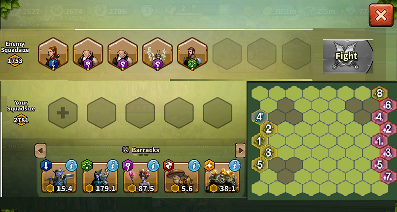
My suggestion is that a thumbnail graphic of the selected battlefield be placed on the right over the shady character roster (similar to below but sharper). The portrait and banner take up a full 1/3 of the upper area of the encounter window, so there is plenty of space. I suggest that the useless portrait be eliminated but even if the personalization of messages, which is a theme throughout Elvenar, is kept, it can be made smaller. Similarly, the prizes can be grouped over the goods cost area, leaving the space above the shady characters free for the placement of the battlefield thumbnail.
To those who say that the miniaturization of graphics is already straining the eyes of older gamers, it looks as if the rewards do not have to be decreased in size to be able to be grouped over the costs - just as long as they continue to place them on a background of contrasting color. As far as the mini-battlefield goes, previewing the battlefield is a strategic advantage that everyone agrees upon, but many in a hurry to 'process the game' do not practice. Being able to see the number of obstructions or to recognize the gestalt of the limited number of gameboards being used will facilitate gameplay. Especially if it eliminates the tendency to go into a battle blind and having to preview the fields after being defeated or having to set up a mock battle, surrender, and then reset the lineup. In this case, even a small battlefield thumbnail is better than the alternatives.
Pros:
Browser view
croppedElvenar.png")
My suggestion is that a thumbnail graphic of the selected battlefield be placed on the right over the shady character roster (similar to below but sharper). The portrait and banner take up a full 1/3 of the upper area of the encounter window, so there is plenty of space. I suggest that the useless portrait be eliminated but even if the personalization of messages, which is a theme throughout Elvenar, is kept, it can be made smaller. Similarly, the prizes can be grouped over the goods cost area, leaving the space above the shady characters free for the placement of the battlefield thumbnail.
To those who say that the miniaturization of graphics is already straining the eyes of older gamers, it looks as if the rewards do not have to be decreased in size to be able to be grouped over the costs - just as long as they continue to place them on a background of contrasting color. As far as the mini-battlefield goes, previewing the battlefield is a strategic advantage that everyone agrees upon, but many in a hurry to 'process the game' do not practice. Being able to see the number of obstructions or to recognize the gestalt of the limited number of gameboards being used will facilitate gameplay. Especially if it eliminates the tendency to go into a battle blind and having to preview the fields after being defeated or having to set up a mock battle, surrender, and then reset the lineup. In this case, even a small battlefield thumbnail is better than the alternatives.
Pros:
- It is apparent that the algorithm has chosen the opposing lineup when the encounter screen comes up. I think it is a safe assumption that the battlefield has already been chosen since the two are often merged in terms of the increment in difficulty. Therefore, no major code routines are required aside from layout.
- In most cases, it will eliminate the need to mock battle.
- It eliminates time-consuming keystrokes that do not increase player investment in Elvenar the way that, say, building and upgrading do.
- It is likely to decrease player 'battle fatigue', allowing gamers to advance further into the tourneys instead of using up their time rehashing a given battle either proactively or retroactively.
- By augmenting productivity within Elvenar, it seems likely to enhance progress within the game.
- Thumbnails of outlier battlefields, those with either abundant or virtually absent obstructions, may quickly allow a gamer to select the more advantageous of either a melee- or range-dominated lineup.
- Will especially benefit mobile users who have no other way of reconnoitering the layout prior to committing troops.
- Visually challenged gamers may not like the thumbnail graphic.
- It will require altering the encounter window.
- It is of no use or little use to gamers who negotiate.
Mobile view
Browser view
Last edited:
")