 Dear forum visitor,
It looks as though you have not registered for a forum account, or are not signed in. In order to participate in current discussions or create new threads, you will need to register for a forum account by clicking on the link below.
Dear forum visitor,
It looks as though you have not registered for a forum account, or are not signed in. In order to participate in current discussions or create new threads, you will need to register for a forum account by clicking on the link below.
Jackluyt
Platinum Leaf -FB
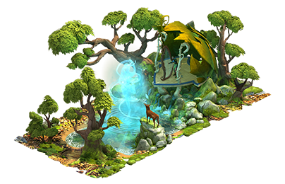
I'm struggling with the massive Fairy Workshops!
Their design is so over-elaborate that I cannot see at a glance whether they are ready to harvest, or need to be fueled up for the next cycle.
The little hammer and zzz thingees get totally lost in the forest of multi-colored curlicues and twiddledy-diddles.
Here is a picture to compare them with the previous Dwarven versions, where the notification thingees jumped off the screen and smacked you right between the eyeballs!
")
I mean - the Fairy Workshops are very pretty, yes.
But they are not, IMO, awfully functional...

Their design is so over-elaborate that I cannot see at a glance whether they are ready to harvest, or need to be fueled up for the next cycle.
The little hammer and zzz thingees get totally lost in the forest of multi-colored curlicues and twiddledy-diddles.
Here is a picture to compare them with the previous Dwarven versions, where the notification thingees jumped off the screen and smacked you right between the eyeballs!
I mean - the Fairy Workshops are very pretty, yes.
But they are not, IMO, awfully functional...
Last edited: