• Dear forum visitor,

    It looks as though you have not registered for a forum account, or are not signed in. In order to participate in current discussions or create new threads, you will need to register for a forum account by clicking on the link below.

    Click here to register for a forum account!

    If you already have a forum account, you can simply click on the 'Log in' button at the top right of your forum screen.

    Your Elvenar Team

Release notes version 0.28

DeletedUser51

Guest
Dear Humans and Elves,

Please use this thread to share your thoughts on the changes that came with the update to version 0.28.
We are looking forward to your feedback!

Kind regards,
Your Elvenar Team
 

DeletedUser1010

Guest
Are we going to be able to see the "i" pop-up window with stats for the enemy n ur troops on the page where u either negotiate or chose to battle again? I know you can hover over it and it shows stats but you used to be able to click on the "i" (like it lets you do in your barracks)and a whole pop-up window would come up that you could hover over the stats and get more details....things like what the special abilities actually do. example: under special abilities(SA) with just the hover pop-up it just gives what their SA is (like wound enemy) not details but when I was able to click on the "i" and a pop-up window came up it would show the SA and then you could also hover over the SA and get the details of what the SA actually does, like for wound enemy- hover over it and see- incoming damage on target in the current round +10% so it was a useful tool to have. I hope you can bring this back.
I know you can go to the wiki page and get that info but I think that's not productive as having it right there like it used to be. not sure if they intended to do away with it or it is something they just need to fix. either way I miss it! lol

The update otherwise looks great! Cant waitXD
 

DeletedUser594

Guest
Are we going to be able to see the "i" pop-up window with stats for the enemy n ur troops on the page where u either negotiate or chose to battle again? I know you can hover over it and it shows stats but you used to be able to click on the "i" (like it lets you do in your barracks)and a whole pop-up window would come up that you could hover over the stats and get more details....things like what the special abilities actually do. example: under special abilities(SA) with just the hover pop-up it just gives what their SA is (like wound enemy) not details but when I was able to click on the "i" and a pop-up window came up it would show the SA and then you could also hover over the SA and get the details of what the SA actually does, like for wound enemy- hover over it and see- incoming damage on target in the current round +10% so it was a useful tool to have. I hope you can bring this back.
I know you can go to the wiki page and get that info but I think that's not productive as having it right there like it used to be. not sure if they intended to do away with it or it is something they just need to fix. either way I miss it! lol

The update otherwise looks great! Cant waitXD
  • Clicking the information button on a unit's avatar in battle shows the unit information window again
 

DeletedUser1122

Guest
Is this the final major changes to the quest system?
 

DeletedUser1010

Guest
Thanks Varron, I over looked that! Glad its coming back=)
 

DeletedUser511

Guest
I hope this graphics setting thing will work. Will we have to turn off the accelerator? Seems to me after the last couple updates its been a pain to play the game.
 

DeletedUser627

Guest
Sometimes my pop ups are transparent - pointing brings up two layers of information at once. Difficult!

Example: pointing at the chat bar, I also get the pop up for whatever item is underneath.

it's become quite irritating - I keep having to slide my city around to get to buttons (chat slider, options icon, quest icon....)

NOTE: I just reported this under "bugs", so please delete from here if appropriate
 
Last edited by a moderator:

DeletedUser43

Guest
Having the same issues as Bobbi. Pop ups are bringing up info from the item underneath. Please fix.

The new world map is simply awful. I liked being able to see the world. Now I can't. Could you please tell me why you don't want us to be able to see? I totally agree with Varron on this. People in my fellowship are complaining as well.

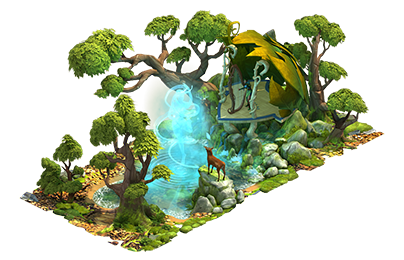
Regarding the wonders.....they look really cool. But, from calculations, I am not sure if they are going to be a help or a hindrance. I am very excited about new content no matter what it is. So, that is great. I think I am too far along in this game to really make use of this new feature though. My last scout took 1 day, 9 hours and the next one will be slower. In order for me to get the number of relics necessary to unlock one, I may have to wait until xmas. But, I wish everyone well who does build them and I am sure I will have KP that I can donate to all their causes in the meantime.

Back to that awful world map....please bring back the old way to see it. Please. This is a step backwards in design.
 

DeletedUser627

Guest
fyi: the Wonders don't show if you have your city graphics set to Low...well, maybe you can see yours, but you can't see anyone else's.

Too hilarious - the only real advantage to having the Wonder is how impressive it looks, and a significant number of players can't even tell whether you have one or not! All dressed up, with no one to see.
 

DeletedUser

Guest
There's a sandstorm on my world map. I don't really mind as I hated seeing things anyway. Looking and seeing and stuff makes me grumpy.
I agree, I can't see the edges of my map at all anymore and have trouble seeing where I want my scout next without moving a little bit and then waiting for the sandstorm to clear and then moving a little more. I used to be able to get to the neighbor I wanted easily but now my landmarks are hidden and I have to hunt for them. Makes me very frustrated. Put it back the way it was please.
 

DeletedUser43

Guest
Brymstone in my fellowship just built the Mountain Halls and it is cool as all get out!!! I simply love the graphics!!! I hope people can see it. Now I can't wait to get to the end of the tech tree! Oooh!!! I see Knowledge Point donations to Brym in my future!! I want that bonus!!!!


(And please please please get rid of the sandy border on the map!! As a blue faced elf I reserve the right to live up to my name and repeat this issue until it is fixed! ;))
 
Last edited by a moderator:

DeletedUser61

Guest
OUTSIDE LOOKING IN
When you think about it, you don't really care what's on the interior of your explored area when you're scouting and attacking sectors.

If you drag your map so that you're on the OUTSIDE LOOKING IN, with your green area near the edge of the screen or in the corner, the current map display is surprisingly effective. Dragging the screen around seems to be a lot smoother now, so that's part of the magic.

If you want to jump back to your city, just click on the compass icon.

I was actually pretty surprised by how well it works.

When I'm visiting the neighbors I've always sequenced Right to Left, Top to Bottom, by just clicking the World icon when I'm ready to go to the next city. Three rows of city is plenty when you're just visiting.
 
Last edited by a moderator:

DeletedUser43

Guest
I think it is great that the map is smoother now. I agree that is great.

The compass icon has been there since Arendyll started. I think it is a fine feature.

Now if we could just get rid of that awful dusty frame then it would be a lot easier to see! Outside looking in, or inside looking out, the more of my computer screen that is filled with map the better. I like vision. It is one of my favorite senses!
 

DeletedUser882

Guest
I am also having a problem with the popups showing info from underneath. The zoom on the cities and the changes to the world map are very difficult on my eyes (a problem I do not have with any of the other games I play). I was hoping we would actually be able to see more of the world map instead of less.
It will be difficult for me to continue with this game - so very sad, I really do love the building and the fellowship!
 

DeletedUser1173

Guest
I truly do not like the edging on the map. I could get used to it, but I really like being able to see more than six provinces on my laptop. :/

The animation on idle goods buildings throw me off as well. Don't like it either, would prefer it to remain still when nothing is being produced :(
 

DeletedUser1161

Guest
The new world map is very difficult to use. My screen is 16:9 and I can only see three provinces clearly from top to bottom. I have to scroll a lot and it's very disorienting. There is mention of the frame being "sized down" in the patch notes. Does that mean that we will be able to see more of our neighbors again?

The locked provinces are also acting oddly. They are only greyed out and show the lock symbol on the telescope after I mouse over them.

I'm only in Ascending Magic, so all the new content is unavailable to me for a long while. That's a bit disappointing. The new wonders are pretty and I'd sure like to start working on one.
 

DeletedUser594

Guest
Looks are so-so but I will say so far at least I'm not having the issues with the map lagging behind when I try to move around. I imagine that's the fix for that problem and I will take the trade off over seeing more of the map. I think it would be helpful to add a few features though to make navigation easier like being able to "pin" a friends city and maybe something to guide us to the last territory scouted but overall it's workable.
 

DeletedUser626

Guest
i don't like the new world map, it's too small of a viewing area in my opinion.
having a default view of the explored map, and surrounding scout-able provinces is my request.

*edit - the changes to the 24 hour goods quest: now requiring supplies seems a bit off. In my opinion, changing the the additional requirement to coins, and rewarding supplies would be better. the factory is on a 24 hour timer, just seems to me supplies would be a better reward now that the goods reward are removed from declinable quests.
 
Last edited by a moderator:

DeletedUser43

Guest
Does the border affect the functionality? :confused::confused::confused: Isn't it like a border you add on a photograph and it is just as easy to remove? Or am I wrong? I can see through a lot of the sand. What don't I understand about why the border is important?

edit: No question the functionality of the map was made much much better. I got around all my neighbors and not one of them disappeared on me! The map moves more smoothly too. Kudos for all that!! Can't we just take care of this little aesthetic issue? Please! Pretty please! Elves don't like sand...we like trees.
 
Last edited by a moderator:
Top